
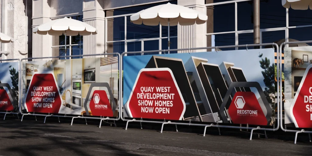
There’s something exciting about seeing your brand on a three-metre banner, a shopfront window or an exhibition display.
But there’s also one common mistake we see all the time.
Many people create artwork for large format printing exactly the same way they would design a flyer or business card, simply making everything bigger.
Unfortunately, large format printing doesn’t quite work like that.
What looks sharp on your computer screen can quickly become blurry, pixelated or difficult to read once it’s enlarged.
The good news is that preparing artwork correctly isn’t complicated once you understand a few key principles.
Whether you’re designing in Adobe, Canva or another design program, these simple tips will help ensure your artwork looks as impressive in print as it does on screen.
One of the biggest differences between standard print and large format printing is how graphics are created.
There are two main types of artwork:

Vector graphics are created using mathematical shapes and lines. They can be scaled to almost any size without losing quality.

Raster images (such as JPEGs and PNGs) are made up of pixels. Enlarging them eventually causes them to become blurry.
For large format printing, logos, icons and text should always be supplied as vector artwork wherever possible.
This ensures they remain perfectly crisp, whether they’re printed on a pull-up banner, vehicle graphic or building sign.
Photographs are different, of course. They will always be raster images, but they still need to be supplied at an appropriate resolution.
Many people assume that because a banner is several metres wide, the artwork file also needs to be enormous.
In reality, large format printing uses different resolution requirements to standard print. Depending on how the finished product will be viewed, artwork at 100 to 150 DPI at full size is often all that’s needed to produce excellent results.
Using unnecessarily high resolutions can create enormous files that are slow to work with and difficult to upload, without improving print quality.
If you’re creating very large artwork, it’s often easier to design at a reduced scale, such as 50%, while doubling the resolution to achieve the same final output.
If you’re unsure which resolution is appropriate, we’re always happy to advise before you begin.
Think about where your finished product will be seen.
A business card is read from about 30 centimetres away.
A pull-up banner might be viewed from two or three metres.
A roadside sign could be viewed from much further away.
As the viewing distance increases:
avoid squeezing in too much information.
A good banner should communicate its main message within a few seconds.
If people have to stop and read several paragraphs, it’s probably trying to say too much.
When it comes to large format design, less is often more.
Most people know about bleed, but safe zones are just as important for large format products.
Depending on the application, banners may include:
mounting systems.
These finishing methods can reduce the visible print area around the edges.
Keep important text, logos and contact details well inside the finished size to ensure nothing is accidentally covered or trimmed.
Every product has slightly different finishing requirements, so it’s worth checking the specifications before finalising your artwork.


Canva has made graphic design more accessible than ever, and for many projects it’s a fantastic tool.
However, there are a few limitations when designing for large format printing.
Very large artwork may exceed Canva’s maximum canvas size, requiring you to work at a reduced scale.
Canva also exports raster artwork for many designs, meaning logos and text may not remain as sharp as professionally created vector artwork when printed at very large sizes.
That doesn’t mean you can’t use Canva. It simply means it’s important to understand its limitations.
If you’re creating artwork in Canva, you might also find our article Designing for print in Canva helpful for general print setup tips.
If you’re supplying a PDF, make sure fonts are embedded. If you’re sending native Illustrator artwork, outline the fonts (or include them). Otherwise your carefully chosen typography may be substituted with a completely different font when the file is opened for printing.
It’s a simple tip that saves a lot of headaches.
Before submitting your artwork for print, ask yourself:
Spending a few extra minutes checking these details can make a significant difference to the final result.
Large format printing is about more than simply enlarging a design. It’s about understanding how people will see it, how it will be produced and how to achieve the best possible result.
If you’d like us to check your artwork before it goes to print, or you’d rather have our designers prepare it for you, your local Worldwide centre is here to help.
After all, we love transforming ideas into impressive finished products.
"*" indicates required fields