Find your local Worldwide   1300 657 006
Eye catching posters banner

How to design eye-catching posters that attract customers

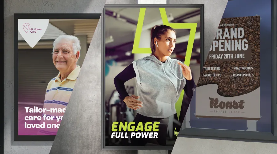
Want to grab attention without shouting from the rooftops? A well-designed poster can do just that—turning heads, sparking interest, and driving action.

Posters aren’t just ink on paper; they’re silent salespeople, working 24/7 to amplify your brand’s message. But how do you design one that truly stands out? One that not only looks great but also delivers results?

This guide breaks down the key principles of poster design, from colour psychology and typography to branding and layout strategies. Whether you’re a startup founder or a marketing manager, these tips will help you create posters that leave a lasting impact.

Motivational gym poster

The power of posters in marketing

Posters offer high visibility, making them an effective and cost-efficient marketing tool for businesses of all sizes. Unlike fleeting digital ads, posters have a physical presence that lingers—especially when strategically placed in high-traffic areas.

Why posters work

  • Instant brand awareness – A well-placed, well-designed poster ensures your message gets seen.
  • Longer engagement – Unlike online ads that disappear with a click, posters stay put, offering repeated exposure.
  • Versatile & scalable – From street promotions to in-store displays, posters can be tailored to different campaigns.
  • Budget-friendly – Compared to digital and print ads, posters are a cost-effective way to boost visibility.

The psychology of colour in poster design

Colour plays a crucial role in how people perceive your poster. Different colours evoke different emotions, influencing how your audience reacts to your message.

Quick colour guide

  • Red – Bold, energetic, and attention-grabbing.
  • Blue – Trustworthy, calming, and professional.
  • Green – Natural, fresh, and associated with health.
  • Yellow – Bright, optimistic, and high-energy.
  • Purple – Luxurious, creative, and imaginative.

Choosing the right colour palette not only enhances visibility but also reinforces your brand identity.
Roast coffee house opening banner

Typography - more than just fonts

Typography affects how your message is perceived and how easily it’s read. The right font can create a sense of urgency, excitement, or sophistication.

Typography tips

  • Legibility first – Make sure your text is readable from a distance.
  • Font pairing matters – Use contrasting fonts for headlines and body text to create hierarchy.
  • Brand consistency – Stick to fonts that align with your brand’s personality.
  • Size it right – Key messages should be large enough to grab attention at a glance.

Balancing visual elements for maximum impact

A great poster design is about balance—using space effectively to highlight key elements without overwhelming the viewer.

Key design principles

  • Use white space wisely – Avoid clutter and let your design breathe.
  • Align & structure elements – Keep text and images well-organised for easy reading.
  • Incorporate strong imagery – High-quality visuals attract attention and reinforce your message.
  • Focus on contrast – Strong contrasts between text and background improve readability.

Incorporating branding & messaging

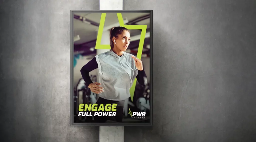
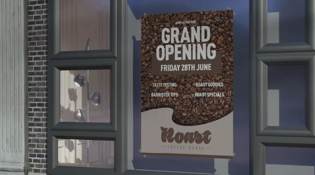
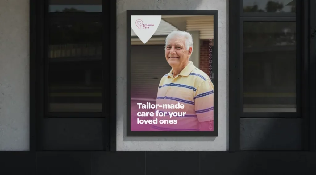
Your poster should feel like an extension of your brand. This means using consistent logos, colour schemes, and brand messaging to reinforce recognition.

Branding essentials

  • Prominent logo placement – Your logo should be visible but not overpowering.
  • Consistent brand colours – Use your brand palette to create instant recognition.
  • Clear call-to-action (CTA) – Tell viewers what you want them to do next (e.g., “Visit Today,” “Call Now,” “Scan for More Info”).

A strong CTA is crucial—it’s the bridge between awareness and action.
Homecare poster

Optimising poster layout

A well-structured layout ensures your message is easy to absorb. Viewers should be able to scan the poster and instantly understand the main takeaway.

Layout best practices

  • Follow the focal point rule – Make your key message the first thing people see.
  • Hierarchy matters – Arrange elements so the most important information stands out.
  • Use a grid system – Keeps everything aligned and visually appealing.

The role of poster printing in design impact

A well-designed poster loses its effectiveness if the print quality isn’t up to par. The right paper type and printing techniques can enhance the final result.

Printing considerations

  • Paper type – Glossy for vibrant colours, matte for a sophisticated, glare-free look.
  • Print quality – High-resolution printing ensures crisp text and images.
  • Durability – For outdoor posters, consider weather-resistant materials.

Printing choices influence how your poster is perceived, so choose wisely to reflect the quality of your brand.

Measuring poster campaign success

A great poster isn’t just about design—it’s about results. Tracking its impact helps refine future campaigns.

Ways to measure effectiveness

  • Use QR Codes or custom URLs – Track engagement by directing viewers to a unique landing page.
  • Monitor foot traffic or sales upticks – Look for changes in customer visits or purchases.
  • Gather customer feedback – Ask how they heard about your offer to gauge poster reach.

Posters remain one of the most effective ways to grab attention and communicate a message. By combining bold visuals, strategic design, and high-quality printing, you can create eye-catching posters that engage customers and boost brand visibility.

Design with intent, and your posters won’t just be seen—they’ll be remembered.

Need help with your design? Our expert team of designers are on-hand to help.

Next

Latest Articles

Sign up to receive our latest promotions & offers

"*" indicates required fields