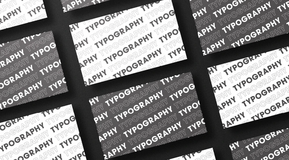
When it comes to graphic design services, typography plays a crucial role in creating visually appealing marketing materials that convey the desired message to the target audience.
Typography is the art of arranging type in a visually pleasing manner, and it is an essential aspect of graphic design that can make or break the success of your marketing campaign. In this article, we will discuss why typography is important to graphic design and provide tips on choosing the right typography for your custom printing and marketing materials.
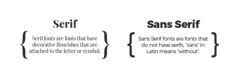
There are several different types of typography that can be used in graphic design, each with its unique style and purpose. Serif typefaces are characterized by the small lines or flourishes at the ends of letters and are often used in print media such as newspapers and books. Sans-serif typefaces, on the other hand, have clean lines and are often used in digital media such as websites and social media graphics.
There are several different types of typography that can be used in graphic design, each with its unique style and purpose. Serif typefaces are characterized by the small lines or flourishes at the ends of letters and are often used in print media such as newspapers and books. Sans-serif typefaces, on the other hand, have clean lines and are often used in digital media such as websites and social media graphics.
Typography plays a crucial role in how your message is perceived by the audience. The right typography can enhance the message and make it more engaging and memorable, while the wrong typography can detract from the message and make it difficult to read or understand.
For example, a serif typeface may be more appropriate for a long-form article or blog post because it is easier to read in print media. A sans-serif typeface may be more appropriate for a website or social media graphic because it is more legible on a digital screen. A script typeface may be more appropriate for a wedding invitation or luxury brand logo because it conveys elegance and sophistication.
When choosing typography for your custom printing and marketing materials, it is important to consider the following tips:
The typography you choose should match the overall look and feel of your brand. If you have a luxury brand, you may want to use a script typeface or a serif typeface with elegant flourishes. If you have a modern brand, you may want to use a sans-serif typeface with clean lines.
The typography you choose should be legible and easy to read. Avoid using decorative typefaces or script typefaces for body text or long-form content as they can be difficult to read.
Contrast can make your typography stand out and draw attention to your message. Use a combination of font sizes, weights, and colours to create contrast and hierarchy in your design.
Using too many fonts can make your design look cluttered and unprofessional. Stick to one or two fonts and use them consistently throughout your design.
Typography is an essential aspect of graphic design that can greatly affect the success of your marketing campaign. By choosing the right typography for your custom printing and marketing materials, you can create visually appealing designs that enhance your message and engage your target audience.
Contact your local Worldwide Centre today for expert help with designing your marketing materials.
"*" indicates required fields