Menu
Menu
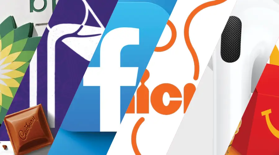
Colour psychology plays a pivotal role in design, influencing how we perceive and interact with various brands and products.
Understanding the subtle yet powerful influence of colours can give businesses a significant edge, especially in the realms of print, design, and marketing.
Colour psychology delves into how different hues can evoke specific emotions, driving consumer behaviour and brand perception. Let’s explore how specific colours can influence perception and behaviour.

Purple, a blend of calm blue and fiery red, often represents luxury, creativity, and wisdom. This regal colour is favoured by brands aiming to exude sophistication and innovation. A notable example is Cadbury, a brand synonymous with indulgent chocolate. The use of purple in its packaging conveys a sense of quality and luxury, enticing consumers to associate their products with a premium experience. Cadbury have even trademarked their signature purple colour so that it can only be associated with them.

Orange combines the energy of red with the happiness of yellow. It’s an invigorating colour that can stimulate creativity and encourage social communication. Brands like Nickelodeon use orange in their logo to capture the essence of fun, creativity, and youthful exuberance. Orange is an excellent choice for businesses targeting a dynamic and youthful demographic.

White is the epitome of simplicity, cleanliness, and purity. In design, white space is not merely ’empty’ space; it’s a powerful element that can enhance readability, focus attention, and create a sense of elegance. It is often used in design to create a minimalist aesthetic, promoting a sense of clarity and freshness. Apple’s use of white in its branding and product design exemplifies how this colour can convey simplicity, sophistication, and a forward-thinking attitude.

Red, a colour that demands attention, is associated with passion, energy, and urgency. It can stimulate appetite, increase heart rate, and prompt impulsive decisions. Fast-food chains like McDonald’s capitalise on red’s attributes to create a sense of excitement and urgency, encouraging quick decision-making and enhancing the appeal of their offerings.

Blue, a colour that evokes feelings of trust, security, and calmness, is overwhelmingly favoured in corporate branding. Its serene qualities make it an excellent choice for financial institutions, technology companies, and healthcare providers. Its association with stability and reliability makes it an ideal choice for businesses looking to establish a trustworthy image. IBM, also known as ‘Big Blue’, and Facebook’s blue logo leverage this colour’s connotations to build a foundation of trust and reliability with their audiences.
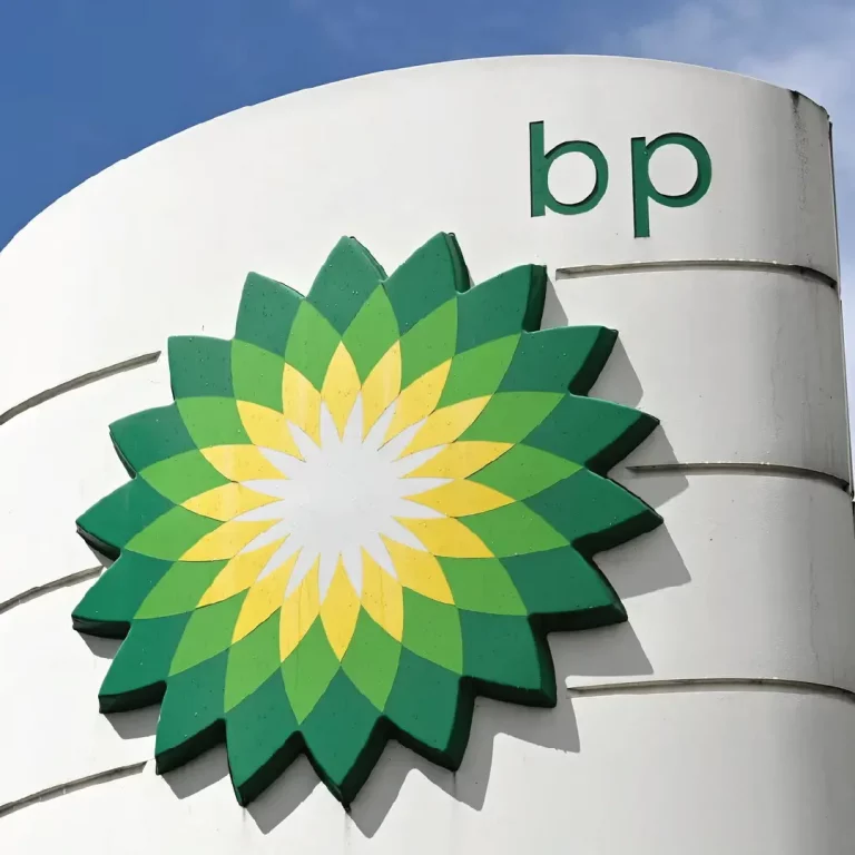
Green, the colour of nature, symbolises growth, harmony, and renewal. It is often used by brands that wish to be associated with environmental friendliness, sustainability. and wellness. Companies like Starbucks use green in their branding to underscore their commitment to sustainability and ethical sourcing. In contrast, BP (British Petroleum) use of green in their branding is an attempt to position themselves as committed to green energy and environmental responsibility, despite their primary association with the fossil fuel industry.
The strategic use of colour in design is not just about making things ‘look pretty’. It’s a powerful tool that can influence perception, evoke emotions, and drive behaviour. By thoughtfully integrating colours into your designs, you can craft compelling narratives that resonate with your audience. If you need to inject some colour into your brand or marketing, talk to your local Worldwide today. We have an expert team of designers who can help bring your ideas to life.
"*" indicates required fields