Menu
Menu

Branding, in its most literal sense, is defined as the act of burning a distinctive mark onto the hides of animals. The Ancient Egyptians were branding their cattle in as early as 2,700 BCE. Although life has changed drastically over the millennia, the purpose behind branding businesses remains the same for us today. Instantaneous recognition and the transfer of meaning.
A leading product or first-class service model may hold a distinct advantage against competitors when looked at from a logical sense. However, branding uses a range of elements to elicit an emotional response from potential and previous customers. It relies on their ability to form a perception and recollect memories of past interactions – almost instantaneously.
A successful brand is built through years of commitment to being memorable and meaningful. The world’s largest brands know that as they grow to serve wider, differing markets, they need to ensure their brands resonate with their new audience while maintaining their identity.
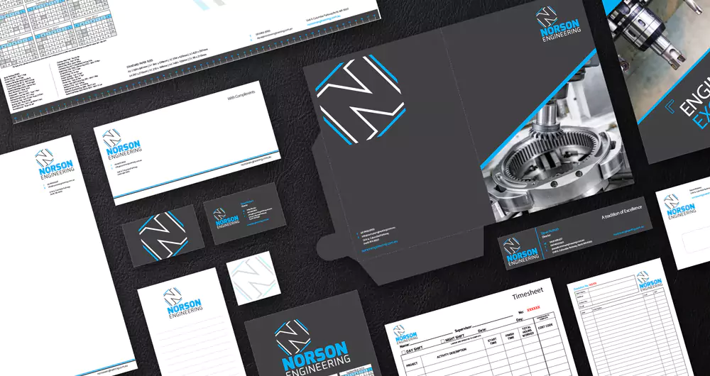
Simply having a business name is a good starting point for businesses to engage a talented graphic designer. They will help build out the wider visual identity by developing a brand style guide. A style guide is an instruction manual on how a brand should be communicated. A brand style guide summarises the standards that accurately represent the brand across internal and external communication materials. The guidelines are broken down into manageable overviews of the brand’s visual elements.
The logo is a key component of a brand’s style guidelines, serving as the brand’s signature. Signatures play a significant role in human creativity and identity, representing personal identity and carrying meaning or commitment.
The logo’s colours are the basis of the colour palette – a key consideration for maintaining a consistent look and feel. Most brands choose four or fewer main colours and don’t stray too far from the colours used in their logo. Colours convey subconscious meaning and be associated with certain human character traits. For example, red is highly complementary when applied to certain product categories, but highly contradictory when applied to others. Once a colour palette is determined, shades and tones are used to give the identity uniqueness. Clever colour selection and repetition can help customers remember a business without a logo.
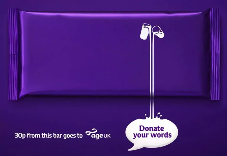
Do you recognise the below colour palette?

Cadbury has successfully trademarked their signature purple in Australia as it is so strongly recognised by Australian consumers.
Consistent or complimentary typography is used to give brands uniformity across touchpoints. Some carefully-selected typefaces have been used so strongly and prevalently that they have become synonymous with certain brands. Unique fonts have been able to communicate a brand’s identity without using any other brand elements.
With time and dedication, a strong brand identity becomes a powerful signifier that allows for flexibility and creativity in marketing efforts. It’s subtly ingrained into the minds of customers as they engage with the brand time after time, delivering a consistent visual message.

Professional graphic design is a worthwhile investment. It sees designers support businesses through the initial establishment of their brand’s identity; the re-branding of their established brands; or the ongoing implementation of their identity within the market.
The first step requires a brand audit to understand which of your business’s brand elements may need updating or require development. Let’s talk and get started and contact your local Worldwide Graphic Designer today!
"*" indicates required fields